Konxer: A Luxe Display Serif Font for Digital Branding
It started with a hero section. I was redesigning a boutique coaching site—clean, intentional, built for calm authority—and the headline just felt… flat. I’d tried three sans serifs, two modern serifs, even a restrained script. Nothing landed with the quiet confidence the brand deserved. Then I loaded Konxer. Typed “Clarity Begins Here” in all caps, set it at 48px on desktop and watched it breathe across the screen. That’s when I knew: this wasn’t just another font. It was a tone-setter.
What Konxer Brings to Your Digital Layouts
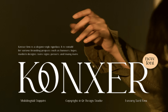
Konxer is a high-contrast display serif font—designed not for paragraphs, but for presence. Its uppercase letters command attention with dramatic thick-thin transitions, sharp serifs, and an elegant, almost architectural rhythm. Think avant-garde refinement meets timeless aristocratic poise. It doesn’t shout; it declares. On screen, that translates into instant visual hierarchy and unmistakable brand distinction—especially in hero banners, section headers, and CTA buttons where emotional resonance matters more than utility.
I tested it across real scenarios: a product landing page for a small-batch ceramic studio, a course sales page for a mindfulness educator, and the homepage of a digital brand kit marketplace. In each, Konxer elevated the perceived value—not by adding ornament, but by anchoring the design in intentionality. Users didn’t just read the headline; they paused. That pause? That’s where trust begins.
How It Performs Responsively (and Where It Shines)
Here’s what I learned after testing on mobile, tablet, and desktop: Konxer works best at larger sizes—36px and up on desktop, 28px+ on mobile—with generous letter-spacing. At those sizes, its contrast remains legible even over subtle image overlays or soft gradients. I used it over a muted linen-textured background on a portfolio site, and the crisp serifs cut through beautifully without harshness.
But—and this matters—it’s not meant for body copy, navigation menus, or form fields. Its decorative strength becomes a liability at small sizes or in dense UI. On mobile, I avoided using it below 24px, and never for anything requiring quick scanning (like pricing tables or feature lists). For those, I paired it with a neutral, highly legible sans serif—think Inter, Poppins, or Manrope—as the workhorse font. That pairing created balance: Konxer for voice, the sans for clarity.
Real Web Use Cases That Felt Effortless
In practice, Konxer thrived where personality and polish intersected:
- Landing page headlines: Used for “Your First Session Is On Us” on a therapy practice site—immediately communicated warmth + professionalism.
- Section dividers: “Our Process”, “The Method”, “Why It Works”—each became a moment of visual punctuation.
- CTA buttons: “Begin Your Journey” stood out cleanly against a light background, especially with subtle tracking adjustment (+40–60).
- Blog post headers: Paired with a warm serif body font for editorial-style posts—added gravitas without stiffness.
- Digital brand kits: Featured as the primary display font in downloadable style guides—clients consistently noted how “premium” it felt.
One surprise: it worked beautifully in dark mode. The high contrast actually enhanced readability against charcoal or deep navy backgrounds—just avoid pure black, which can mute its subtlety.
What to Check Before You Implement
Before dropping Konxer into your next project, I recommend verifying a few practical details:
- Webfont formats: Confirm it includes WOFF2 (for optimal load speed) and fallback options if you’re self-hosting.
- Weight availability: The standard release includes one bold weight—perfect for display use, but don’t expect light or medium variants for layered hierarchy.
- Ligatures & alternates: While not essential for web, some stylistic alternates add nuance to headlines—great for hero text where every detail counts.
- Licensing: Ensure your license covers commercial web use, especially if embedding in client sites or SaaS dashboards.
- Multilingual support: Covers Latin-based languages well, but verify if you need extended diacritics for European or bilingual projects.
When to Reach for Konxer (and When to Pause)
Reach for Konxer when you want to signal craftsmanship, luxury, or thoughtful differentiation—especially in spaces where first impressions shape perception: landing pages, portfolio headers, premium service offers, or branded campaign microsites. It’s ideal for creators who sell confidence, calm, or curated experience—not just features.
Pause before using it for: navigation labels, error messages, data-dense dashboards, or any interface where speed and accessibility are non-negotiable. It’s not a utility font—and that’s its superpower. Let it do what it does best: make people stop, look, and feel something before they even scroll.
At the end of the day, Konxer isn’t about decoration. It’s about distillation—of voice, of values, of vision. When your website needs to say, “This matters,” in the quietest, most confident way possible, Konxer is ready to speak.